Pen & Pixel’s Shawn Brauch On 10 Iconic Cash Money Album Covers
The designer behind the much-loved covers that defined Southern hip-hop in the 90s and 00s talks about some of his best designs.
Shawn Brauch found himself at the center of the hip-hop universe in the 1990s and early 2000s. As the Pen & Pixel designer behind iconic album covers for Cash Money (in addition to art for Rap-A-Lot and other labels), Shawn, alongside his brother, Aaron, quickly emerged as key players in the explosion of rap music emerging out of the South. With nothing more than $1,000 and a kitchen table when they started their company, Pen & Pixel almost single-handedly introduced the visual aspects of the bling-bling era to the commercial public.
That’s not to say that Pen & Pixel’s ascent occurred hitch-free. “Master P came to us not because he wanted to work with us, but because we worked with an artist named Tre-8,” Shawn explains. “Tre-8 wanted this ice cream truck blown up on a cover and wanted the ice cream man inside the truck to be blown into a million pieces. Of course, I had no idea what was going on because I’m completely engrossed in my work, but it ended up being a Master P diss because Master P’s the ice cream man.” Suffice it to say, Master P and his “very big” group of bodyguards weren’t thrilled with Shawn’s work. The Parsons School graduate was greeted in his office by P and his crew, and received a message: Don’t do it again. Shawn agreed, but if he hadn’t worked with Tre, there’s a chance he never would have linked up with P in the first place.
This accident would have had ramifications on the entire history of hip-hop, as Master P’s No Limit/Cash Money Records and Pen & Pixel created some of the most iconic album covers in rap. There’s the burning hellscape of Juvenile’s 400 Degreez, the maximal excess of Big Tymers’ How You Luv That, and the early Lil Wayne projects that foreshadowed Weezy’s remarkable impact on the game. Behind every Pen & Pixel cover is a fascinating story, and below, we had Shawn walk us through many of our favorites.
For more Cash Money, check out the Urban Legends store.
![]()
B.G. – Chopper City (1996)
This cover was really interesting because B.G. came in and he sat down with us and we started talking with him and Baby [Brian Williams, AKA Birdman]. I was like, “Okay, what is this Chopper City thing? First of all, what’s a chopper?” That shows the level I was working at back then.
BG was like, “Oh boy. A chopper’s an AK-47.”
“Well, why do they call it the chopper?”
“Well, when you shoot this weapon at people,” he said, trying to be as diplomatic as possible, “it has the tendency to remove limbs and it’s really a bad, bad gun.”
He explained the idea a little further, to the point that I came up with an idea, about these bullets flying around and there’s no escape from the hood. You never know when one of these massive bullets can come down and rip you apart. I started sketching this thing out. I went out to a surplus store and I bought a 50-caliber round, and I drove a hole through it and went into the studio and hung it up on a coat hanger and started photographing it at different angles. Then I photographed B.G. in the studio, went out and got a stock picture of the 5th Ward over in the Magnolia Projects, and put the whole thing together.
![]()
Magnolia Shorty – Monkey On Tha D$Ck (1996)
When someone comes to you and they’re like, “My album’s going to be called Monkey On Tha D$Ck,” what’s your first thought?
When Baby calls me up and said, “Yo, man, this one’s going big. Got it? It’s like ‘Monkey On My Dick,’ but you can’t put dick on there.”
I was like, “Oh, all right. So what is that all about?”
He says, “I want some honeys twerking.”
I was like, “Well, we’ve got this one body of this one girl, but I don’t think we have a copyright release on her face.”
He said, “Well, do something about it.” When Baby tells you to do something, you do it. I went and got one of my copyright release models and I pulled her head off and put the one Baby wanted on instead. At that point in my career, I’m just listening to my clients and I’m putting it all together and shooting in the dark.
Whose idea was the Cash Money ass tattoo on the cover?
Oh, that had to have been Baby.
![]()
Master P – MP Da Last Don (1998)
With MP Da Last Don, your covers move into more maximal territory for Cash Money.
This one featured a dedicated photoshoot. Some of the covers that you see at Pen & Pixel are not dedicated photo shoots, which means we have to either work from the images that are supplied by the client or we have to go back into old photo shoots and take a head off and put a body on. We’ll have to do a body double because the client just can’t fly down to Houston and get the shot done. It’s a waste of time. We wanted to make it as convenient as possible. But P knew that this album was going to be a big one.
He called us up and he’s like, “This is what I’m thinking.”
I made a sketch for him, and I said, “Let’s really work with this perspective with your hand and show off this ring and a couple other elements.”
He comes down, we go in the studio, and he lines up for the studio shoot. When you’re dealing with A-listers, you have a set timeframe. They have their handlers and their managers. They come up to you and say, “Okay, Percy Miller is going to be available for 15 minutes. Exactly 15 minutes. And that includes wardrobe and makeup.”
I’m like, “Oh my God.”
We would have the studios completely set and secured. The lights are set. We’d have body models already in there, so we already knew what our lights were going to be like, our reflections. We already knew what our F-stops were. Everything was literally ready to go.
We only had 15 minutes, so we used multiple cameras. P was feeling it and we were going through the shoot and he’s got these massive rings on. He had lost some weight just before the shoot, so one of the rings fell off in the studio and bounced across the floor with that familiar sound of gold hitting the ground. We go to pick it up, and it’s missing one of the big diamonds.
I’m like, “P, dude, we lost a diamond.”
He says, “Yeah, man, don’t worry about it. I don’t have time for that. Let’s just get the shoot done.” We finished off the shoot and spent the rest of the day looking for the diamond. It was gone.
When we were putting the cover together, he wanted the typeface to be encrusted with the bling-bling stuff, like his logo. That was actually one of the first applications where we did this whole crushed down effect, and really pushed the perspective with his hand.
![]()
Big Tymers – How You Luv That (1998)
You really threw the kitchen sink at this cover. How do you balance that excess while still making it clear and concise?
You’re looking at one of those pieces and that’s a pretty typical spiral piece, where we want you to start off with Mami, look at him, and then bounce up, go to the Ferrari, bounce around the title, come back down and you’ll see B.G. in the back, bounce around to the motorcycle, and then come down and land on Baby.
You don’t get to Baby until the end. It really works.
That’s right. At the end. It’s like a dessert, right?
![]()
Juvenile – 400 Degreez (1998)
This is one of the most iconic Pen & Pixel album covers for Cash Money. Did you know you were onto something when you were designing it?
To tell you the truth? No. 400 Degreez was another spiral job. We had shot Juvie in the studio. That was the perfect shot for a cover. There were a couple of shots that we wanted to use. It doesn’t have that dramatic perspective effect. We pushed that whole diamond effect and that whole in-your-face style with a very dominant color up front. Once the music got the momentum, people wanted to go and get it. Then it was a recognizable cover, and I think that’s how the momentum picked up. Yeah, it’s just such a great album. Obviously, the album would have done well with a bad cover. It’s brilliant. But the strength of the cover didn’t hurt, either.
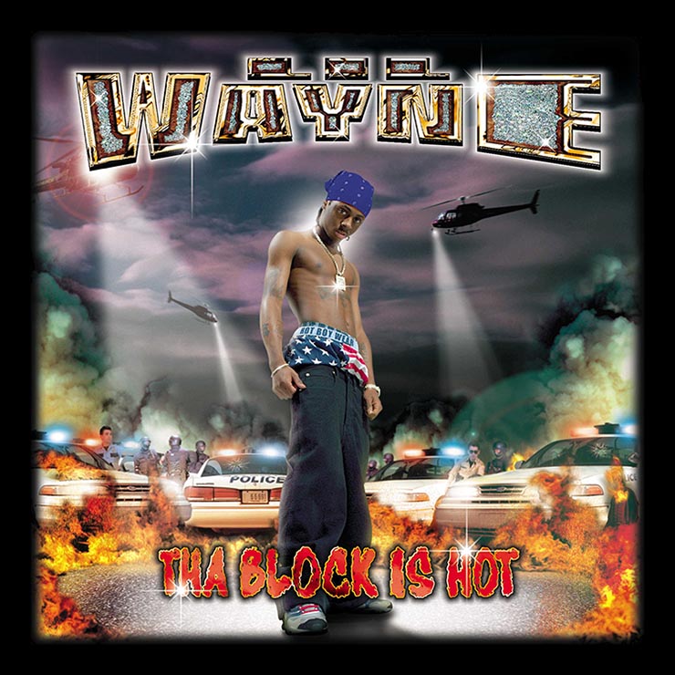
Lil Wayne – The Block Is Hot (1999)
The Block Is Hot. 19-year-old Lil Wayne. What was he like?
Well, I knew Wayne when he was 14. When he first came in, I joke you not, he came in with Hot Boys, with Ronald and Brian, and I thought he was their son. Because he’s not a tall guy now, but when he was 14, he was a really small guy. But the thing that was so unique about him was he carried this book around. It was like a notebook, maybe nine inches by 10 inches. This kid would write down everything. He was like a student, he was learning from everybody. He would just write everything down in this book. It was interesting to see at the time, but later on we know that he was actually getting inspiration for his songs.
The cover itself is brilliant.
Yeah. We were cranking them out at that time. From ’98 to 2000 or 2001, things were just insane. It was seven days a week, 18 hours a day, living at the office. We had beds at the office for the creatives and we were cranking them out as fast as we possibly could do it. The quality still had to be there, though.
Am I wrong for thinking this cover works a little more front to back than like a spiral?
I totally agree. That is absolutely correct. That is not a spiral job. This one kind of hits your face. You look down and go into his face and then you’ll go in and pull into the background, but it doesn’t spiral.
![]()
Hot Boys – Guerilla Warfare (1999)
This is another all-time album.
With Guerrilla Warfare, everything was shot separately. We did very few group shots because it didn’t allow us the malleability to move them if we needed to move them or flip their heads. On that one, we had a light shining underneath an orange gel to give their faces a glow. We have Lil Wayne come over. We’re like, “Stay right there,” pop a shot. Next Juvie, come on over. Same thing. Turk, come on over, same thing. B.G., come on over. So we wanted to keep everything as separate as possible. And we still try to do that now. I rarely will have two people in one shot. It makes it difficult for me to bring them forward, to bring them back. You know what I mean? I wanted as much flexibility as possible.
The burning building. How did that idea come about?
You know, I did it late at night. They wanted something pretty hard. I’m like, “If we’re going to do a fire theme, let’s do it.”
They were like, “All right, let’s get some cop cars.” They always have to have cop cars blowing up. So that’s the theme of the thing, this anti-law enforcement cover. I think it turned out pretty cool.
![]()
Cash Money Millionaires ― Baller Blockin Soundtrack (2000)
Did you get all these guys in the same room?
These guys were shot separately. The original one that we did, you could actually see the guns. Because they all had MAC-10’s and Uzi’s and all kinds of stuff, just hanging in the studio, we had to be safe. Like, “Firearms check, you got to make sure that the gun is empty.” There’s nothing more intimidating than having someone put a MAC-10 into your camera’s face and try to shoot it. They wanted the Magnolia Projects to be in the back. So when I was out there, they brought me down, under high security, and I shot a whole bunch of pictures of the Magnolia Projects, which I used in a lot of other covers for them.
![]()
Lil Wayne – Lights Out (2000)
Lights Out is pretty different from the covers Pen & Pixel normally did for Cash Money.
Correct. With Lights Out, we had reached, in my opinion, the pinnacle of bling-bling and all of these multiple layers style shoots. We came up with another style and it was called millennial-style or millennium-style. That’s where we started moving away from that total spiral, bling-bling thing, into a little bit more faded background and subliminal style.
This cover is a little bit more haunting, a little bit more ominous. And again, we were limited on the time that we had with the artists in these situations. Lil Wayne is flying in and we have 10 minutes with him. We sketched it out, and he wanted something a little bit more ominous, a little harder.


