Cover Story: A History Of Album Artwork
Music and art will always go together, as artwork can be as much a part of a record as the sound.
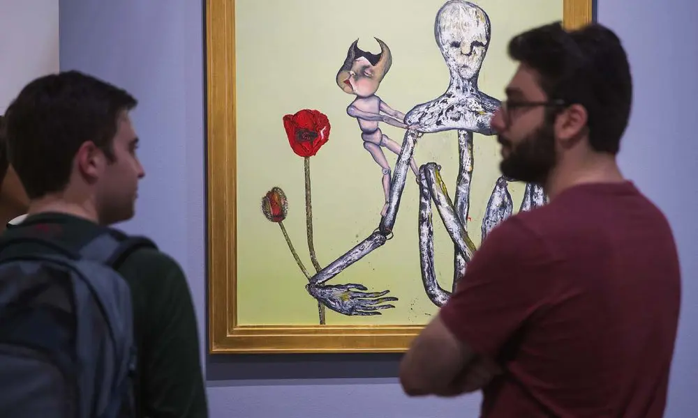
Tony Bennett said of the marvelous album covers of the 50s that, when you bought a record, “you felt like you were taking home your very own work of art.” Indeed, artwork can be as much a part of the identity of a record as the sound. Billions of music fans over the past century have taken pleasure from looking again and again at old album covers.
The name “album” comes from a pre-war era when it literally referred to the album that contained the 78rpm shellac disc, held in a drab heavy paper sleeve with only a title embossed on the front and spine. Sometimes the discs were contained in a leather book, similar to a photographic album.
Early pioneers
The first signs of change came in the 30s, from pioneering designers such as Alex Steinweiss, whose illustrated covers – for singers such as Paul Robeson, or the classical records of Beethoven – led to huge increases in sales. However, it was the advent of the long-playing 33⅓rpm record that changed everything. The heavy paper used for 78s damaged the delicate grooves on LPs, and record companies started using a folded-over board format sleeve. The format was ripe for artistic experimentation and ultimately led to covers such as The Rolling Stones’ Sticky Fingers – something unimaginable in more conservative times.
A landmark artwork that first attracted mass attention in America was the Capitol Records design for Nat King Cole’s The King Cole Trio album – a lively abstract image featuring a double bass, a guitar, and a piano keyboard under a gold crown. The four 78rpm records housed inside made history, topping the first Billboard Best Selling Popular Record Albums chart, on 24 March 1945. The King Cole Trio spent most of the rest of the year on the bestseller list, with many of its singles reaching No.1.
There was no turning back. Nat King Cole showed that cover design was going to be a massive cultural influence; it was one of the few mediums which reached millions of people in the golden age of radio and before television had become king. Moreover, the music sales industry had a global impact, because it provided designers with a way to express their creativity and originality to the whole world. A host of renowned artists, including Andy Warhol, Roger Dean and Burt Goldblatt, kick-started amazing careers by designing album covers.
Capitol Records have a proud history of album art, utilizing talented individuals such as painter Thomas B Allen and costume designer Donfeld (Donald Lee Feld), whose first job, after graduating from college, was as a designer and art director at the company. Donfeld was the man behind the cover of Aaron Copland’s Billy The Kid album, and he went on to design the iconic Wonder Woman costume.
Jazz-era designs
Many of the greatest covers of all time are associated with the post-war jazz and bebop era. Jim Flora, who had trained at the Chicago Art Academy, worked in advertising before transforming RCA Victor’s art department in the 50s. “I was hired because I was the jazzman,” he said. Flora paid tribute to Steinweiss’ genius and his role as the man “who invented the record jacket… we called the old sleeves ‘the tombstone’ and we got rid of them as soon as possible.”
Flora’s distinctive drawing style was a light-hearted blend of caricature and surrealism, with humorous juxtapositions of physically exaggerated characters, some with Picasso-skewed eyes. His celebrated portrayals included Louis Armstrong and Shorty Rogers. Flora came up with monthly masterpieces, including the album covers for Bix + Tram and Kid Ory And His Creole Jazz Band. He used pigmentation to make Benny Goodman, Charlie Ventura, and Gene Krupa look like bedspread patterns.
As a jazz fan, Flora adored working closely with the musicians. He went to a recording session to sketch Duke Ellington, recalling: “Duke was always a very affable, wonderful man. He would come over, check on me, and say, ‘Oh that wasn’t a very good profile. I’ll give you a full face.’” Asked about his magnificent work, Flora said simply: “All I wanted to make was a piece of excitement.”
Groundbreaking photographers
Art was closely intertwined with jazz in this era, something that pleased not only designers and customers but the musicians themselves, as Tony Bennett noted. Records were little cultural artifacts. Hawaii-born graphic designer S Neil Fujita worked at Columbia Records from 1954 to 1960 and designed covers for Charles Mingus, Art Blakey, and Miles Davis, among others. He brought modern art, including his own paintings, into the equation, for example in his cool design for Dave Brubeck’s Time Out album, which showed the influence of Picasso and Paul Klee.
It wasn’t only designers who played a part in this era; photographers became a key component of the process. Many of the best-known Impulse! covers were by designed by art director Robert Flynn and photographed by a small group that included Pete Turner (who shot many great covers for Verve and was a pioneer of colour photography), Ted Russell, and Joe Alper (a man who went on to take some iconic Bob Dylan images).
One of the most renowned photographers was Charles Stewart, responsible for cover shots on more than 2,000 albums, including his wonderful portraits of Armstrong, Count Basie, John Coltrane, and Miles Davis. He was introduced to the record industry by his college friend Herman Leonard and never looked back. Leonard himself is one of the most respected jazz photographers of all time, to the extent that Quincy Jones remarked that “when people think of jazz, their mental picture is likely one of Herman’s.”
Bold typography
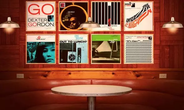
Sometimes it was just bold use of typography – as in Reid Miles’s design for Jackie McLean’s It’s Time – that produced a simple yet eye-catching triumph. Miles said that in the 50s typography was “in a renaissance period.” Sometimes companies chose an iconic symbol or look that would define their output – as Impulse! did with their trademark black, orange, and white livery and striking logo.
This post-Second World War era was when the edgy modernism of bebop began to guide the innovative output of Blue Note. The label had some remarkably talented designers working for them, including Paul Bacon, whose many great covers included Thelonious Monk’s Genius Of Modern Music and Dizzy Gillespie’s Horn Of Plenty. Bacon went on to create the iconic first-edition design for Joseph Heller’s novel Catch-22.
As well as gifted designers, Blue Note co-owner Francis Wolff’s own powerful photographs of musicians (playing music and relaxing off stage) also helped forge the label’s instantly recognizable identity. His photograph for John Coltrane’s Blue Train, showing the saxophonist looking anxious and lost in thought, is like a journey into a genius’ psyche. The practice of using powerful photographs of the musicians has survived, and can be seen in the simple yet arresting photograph of Norah Jones on the 2002 album Come Away with Me.
“Everything went photographic”
According to Flora, 1956 was the year “everything went photographic,” and it was during that year that a landmark photograph was taken for Ella And Louis. The pair were so famous by then that they did not even have their names on the album cover, just the gorgeous image taken by Vogue photographer Phil Stern, known for his iconic studies of Marlon Brando, James Dean, and Marilyn Monroe. The image-cementing photograph of rock stars would later play a major part in some of the great 60s and 70s album covers.
David Stone Martin sometimes drew his covers with a crow quill pen, something he did for the iconic Verve album Charlie Parker With Strings. Martin, whose work has been on show at the Smithsonian and the Museum Of Modern Art, did so many great album portraits for the Jazz At The Philharmonic albums in his distinctive solid black-ink lines (including likenesses of Charlie Parker, Ella Fitzgerald, and Count Basie). He developed a serious and sensual image of jazz.
When Norman Granz started his Jazz imprint at Mercury Records, it was to Martin that he turned for many of the designs that graced Clef, Norgran, and, later, Verve’s records. His prodigious output is awe-inspiring: it has been estimated that there are around 400 albums for Granz bearing Martin’s signature, including the Parker series and those for Billie Holiday. Other cutting-edge record labels, such as Prestige and Riverside, also featured his superb covers, such as Relaxin’ With The Miles Davis Quintet.
When the new 12” format came along it was Reid Miles, a 28-year-old designer who had worked for Esquire magazine, who came to prominence. His debut for Blue Note, as co-designer with John Hermansader, was a cover for a 10” album by the Hank Mobley Quartet in late 1955. But the first album to carry the sole name Reid K Miles was far from modern – a Sidney Bechet release a few months later.
Reid, who also took photographs for covers, was paid only around $50 per creation, and often did it all as extra weekend work – and occasionally farmed out work to a young Andy Warhol. Over a decade he created some of Blue Note’s most brilliant designs, including output from Kenny Burrell and numerous gems for the Blue Note 1500 Series. Miles, who would later create covers for Bob Dylan and Neil Diamond, went on to make celebrated television commercials.
John DeVries would have been celebrated if he did nothing other than the one stunning illustration of Billie Holiday for a Commodore Record in 1959. DeVries had a real affinity for the music he was representing visually. Before moving into the album world, he designed a famous flyer for a 1942 Fats Waller concert and was also a noted song composer. Along with Joe Bushkin – a member of the Tommy Dorsey band – DeVries co-wrote the hit “Oh! Look at Me Now,” a song that helped launch the career of a young Frank Sinatra.
DeVries produced designs for some of New York’s legendary jazz clubs along 52nd Street, most notably The Famous Door. In the 70s, he designed the interior of the final incarnation of Eddie Condon’s on West 54th Street. He encapsulates why so many jazz album covers were special: the people making them had a sense of integrity to the music and dedication to the performers. DeVries moved with the times, too. He was working on illustrations up to his death in 1992 – aged 76 – including covers for CDs by Clark Terry and Teddy Wilson.
“The rock’n’roll revolution”
It wasn’t just jazz that was undergoing an album revolution in the 50s. At the start of the decade, most rock music was sold as cash cow 45rpm singles; albums were primarily used to collect hits together in one package. The marketing was usually tied to cinema releases, and the imagery for many albums – especially soundtrack ones – came from film posters, such as Jailhouse Rock. Sometimes the albums were just stunning photographs with lettering, such as William V “Red” Robertson’s picture of Presley for the RCA album of 1956. There was also a plethora of what has been called “Technicolor retouched grins”, with covers featuring full-size pictures of the faces of young crooners such as Frankie Avalon.
There were innovative people at work in the popular music industry in that decade. At Capitol Records, Ken Veeder, who was head of the photographic department for more than 20 years, designed a number of impressive covers, including Gene Vincent’s 1956 album Bluejean Bop!. Other designers blended black-and-white and color images, as in Decca’s Little Richard LP. Some used striking images, as in the lone wolf illustration for Howlin’ Wolf’s 1958 Chess album Moanin’ In The Moonlight. Topical concerns also sometimes featured, as in the mushroom cloud photograph on the cover of The Atomic Mr. Basie.
Breaking the mold
In the 60s it became fashionable for bands to commission covers from artists and art school friends. The Beatles famously worked with Peter Blake and Richard Hamilton; The Rolling Stones with Warhol and Robert Frank. Young designers who were interested in the music began developing the imagery that is still associated with rock’n’roll. In London, rock music intermingled with the worlds of fashion and fine art.
The Beatles’ Revolver album of 1966, featuring the work of Klaus Voorman, was a stepping stone – and With The Beatles was another memorable cover – but nothing quite matched the impact of the Blake/Jann Howarth cover for Sgt Pepper’s Lonely Hearts Club Band. That cover truly broke the mold, not least for being an album where music and visuals began to meld as one creative entity.
One musician who has taken a keener interest than most when it comes to album covers is John Mayall, who left a career as a graphic artist to form The Bluesbreakers. “I always excelled in art and went to junior art school,” Mayall said. “I still use my artistic experiences to design album covers, posters, and things that are related to my musical career. They now run hand in hand, really. Of more than 50 or so albums I’ve recorded, I designed at least a third of the covers.” One of his most famous was Blues Breakers With Eric Clapton, which became known “The Beano Album” because Clapton, who later admitted he was in an “uncooperative mood” during the photo-shoot, started reading a comic. Mayall decided to use that shot.
Colin Fulcher (better known by his legally adopted name Barney Bubbles) cut his teeth on the satirical magazine OZ, and, later, his designs for Hawkwind, Brinsley Schwarz, and Nick Lowe were hugely influential. He was a genuine original and adroit at blending imaginative typography with art. His cover for The Damned’s 1977 album Music For Pleasure features a pastiche of Kandinsky paintings that spells out the band’s name. Lush, witty artwork was a feature of his work for Elvis Costello And The Attractions. Bubbles also worked with Ian Dury (who had studied graphic design and been an art school teacher himself), creating the Bauhaus-influenced logo for Dury’s group The Blockheads.
Coulthart, who created three Hawkwind covers, said: “Barney Bubbles and a handful of others turned vinyl packaging into a real art form. The windows of record shops were like a street-level art gallery, constantly delivering new surprises. Barney was at the forefront throughout, even if we didn’t always know it – a true Pop Artist.” Esteemed designer Peter Saville calls him “the missing link between pop and culture.”
The Rolling Stones broke ground with their covers in the 60s. The band were never short of self-belief, which shows in the bullish poses for Nicholas Wright’s photograph for their debut album, which contained no mention of the band’s name on the cover. For the follow-up, 1965’s The Rolling Stones No.2, they used a cover shot taken by the celebrated David Bailey, with Mick Jagger stuck at the back of the group. Bailey said: “With The Rolling Stones I had a connection. And I liked the idea that they dressed like people on the street.”
The stark, in-your-face approach, continued with Out of Our Heads (1965) – shot by Gered Mankowitz because Bailey was unavailable – and did not really change until a couple of years later with the 3D artwork for Their Satanic Majesties Request, when psychedelic poses and quirky costumes were all the rage in the year of Sgt Pepper. A 50th-anniversary deluxe box set reissue brings that original artwork back to life.
By the end of the 60s, graphic designers such as Wes Wilson, Alton Kelley, and painter Stanley “Mouse” Miller were key members of the San Francisco psychedelic music scene. The West Coast scene was having its own creative flowering, and Grateful Dead albums began to reflect the artworks they were housed in. Mouse, who had made his name in hot-rod art and painting T-shirts at custom car shows, played a key role. Miller was responsible for the “skull and roses” logo that became the Grateful Dead’s enduring hallmark. Miller, a born iconoclast, copied a block print image on a poem he found in the San Francisco Public Library. “I thought, ‘Here’s something that might work for the Grateful Dead,’” he recalled.
Mouse designed many of the fantastic albums and posters that so appeal to the legions of Deadhead fans, and his work adorns many classic albums, including Workingman’s Dead and American Beauty. Art and imagery were powerful tools for the Grateful Dead, and Mickey Hart even had custom-painted drum kits.
The 60s was also an era when album covers were becoming more defiant and raunchier. The cover for The Velvet Underground And Nico featured a bright yellow banana print from Warhol, contrasted against a clean white background. Original pressings featured the banana as a sticker, complete with instructions to “peel slowly and see.” If you did this, a suggestive flesh-colored banana was revealed. But creating the artwork was too time-consuming and expensive – each sticker had to be hand placed – so the sticker ideas were abandoned for later pressings. On the cover of The Rolling Stones’ 1971 album, Sticky Fingers, there is simply a photograph of a man’s crotch – albeit covered by jeans. (Again, first pressings were interactive: the jeans’ zipper could be drawn to reveal underwear.)
Album art as concept
Album art as a concept was the new thing, and British designers Storm Thorgerson and Aubrey Powell were at the forefront with the firm Hipgnosis. Some of their designs have become symbols of music in the 20th Century, such as the giant inflatable pig over London’s Battersea Power Station which graced the cover for Pink Floyd’s Animals (1977); or the disturbing image of blonde-haired, nude children climbing the Giant’s Causeway for Led Zeppelin’s Houses Of The Holy (1973). Thorgerson said they wanted to encapsulate in art what bands were trying to say in their music: “Pictures of a band, like The Beatles, or Take That, what do they tell you? They tell you what they look like, but nothing about what’s in their hearts, or in their music,” he said. “If you were trying to present an emotion, or a feeling, or an idea, or a theme, or an obsession, or a perversion, or a preoccupation, when would it have four guys in it?”
Hipgnosis used photography to powerful effect and seemed to have a constant stream of ideas. They became especially known for their association with Pink Floyd – especially their cover for The Dark Side Of the Moon. Dave Gilmour called them his “artistic advisors” and Powell said his relationship with Thorgerson worked because “I had a vision to build a company, he had the intelligence to create an art-house – and that’s exactly what Hipgnosis became.”
They suited an era when prog rock musicians were keen on overblown and fantastical album covers. With their ability to mix sex, surrealism, and suburban alienation, Hipgnosis became key artistic inspirations in that era. So did artist, publisher, and designer Roger Dean. Quickly becoming to Yes what Hipgnosis were to Pink Floyd, Dean provided artwork for the band for nearly five decades, including for their 2014 live set Like It Is.
Renowned for the dreamy scenes he created for Yes, and also for bands such as Asia, Budgie, Uriah Heep, and Gentle Giant, Dean called his work “otherworldly scenes” but insisted, “I don’t really think of myself as a fantasy artist but as a landscape painter.” Some of the landscapes were ambitious and imaginative. His cover for Steve Howe’s first solo album, Beginnings (1975), for example, was partly based on the landscape seating he designed for Ronnie Scott’s Jazz Club in 1968.
In the same way that Dean became synonymous with Yes, Hugh Syme’s name – and art – is closely associated with prog legends Rush. He designed the artwork for their third album, Caress If Steel, and went on to create the band’s iconic “Starman” emblem.
“In no other circumstances would that happen”
Just as Blue Note was inextricably linked with the names of designers such as Hermansader and Miles, Peter Saville’s name will forever be associated with Factory Records and his brilliant work in the late 70s and 80s. Saville recognized as one of the world’s foremost graphic designers, said he was intrigued by album sleeves from the moment he bought the British version of Kraftwerk’s 1974 album Autobahn.
Four years later, he approached Tony Wilson at a Patti Smith gig, and together they launched Factory Records. Many of the designs on which Saville’s reputation rest were from this period, including the diagram of a pulsar’s radio waves on the cover of Joy Division’s Unknown Pleasures, and the appropriation of Henri Fantin-Latour’s painting A Basket Of Roses that adorns New Order’s Power, Corruption And Lies.
Part of what made his work so exciting was that the bands gave him a completely free hand to design. “I was left to my own devices and it turned out that I had my own agenda,” he said. “In no other circumstances would that happen. If I’d gone into any other kind of design practice, forget it.” Though he created pioneering work, it was for a limited time. After turning 30, Saville said he had no interest in the “dead art” of album design. He went on to have an amazingly varied career, including, in 2010, designing the England football team’s shirt.
Along with Factory Records, another label that enjoyed a symbiotic relationship with a designer was 4AD with Vaughan Oliver, via his two design studios, 23 Envelope and v23. Oliver created classic album covers for Cocteau Twins, Ultra Vivid Scene, His Name Is Alive, Throwing Muses, The Breeders, Lush, This Mortal Coil, Scott Walker, and Bush.
However, his most lasting design relationship was with Pixies. For over three decades, Oliver’s vivid and erratic typography, and witty – and sometimes bleak – imagery has appeared on their album covers, while his work with 4AD was partly responsible for defining the look of British post-punk music. 4AD founder Ivo Watts-Russell gave Oliver the artistic freedom to create the graphic identity of the label, and he responded with a remarkable body of work. Oliver has offered an intriguing explanation of the appeal of designing album covers, saying: “I like working in the medium of music sleeves. I enjoy the collaboration with the music kind of working in tandem with it. The goal we’re [graphic designers] aiming for is to reflect the music; the sleeve should be a gateway into what the music is about without defining it but also providing a suggestive mood and atmosphere.”
Still pushing the envelope
Showing that jazz labels still know how to push the envelope, the German independent record company ECM (Edition Of Contemporary Music) has received widespread acclaim for its unique cover designs. There have been art gallery shows of ECM covers in Europe, and there are two books devoted to the label’s visual presentations of music. Over the years, the collaboration between Manfred Eicher, the label’s founder and producer, and designers – including Barbara Wojirsch, Dieter Rehm, and Sascha Kleis – has produced some startling covers. Among the best are those for Eberhard Weber and Keith Jarrett. Sometimes a musician is directly involved in the look of the album. On Jarrett’s Sleeper, the red title typeface comes out from a black background, with creepy horror undertones. “The first impulse came from Keith,” Eicher said about the red lettering, “and then we developed it.”
As we have seen with Mayall, many creative musicians like to have a big say over their own album covers, either by providing the artwork or by helping with the concept and guiding it through. Among those whose paintings have adorned covers are Cat Stevens, a former student at the Hammersmith School Of Art in London, who drew the cover for Tea For The Tillerman’; Captain Beefheart (many of his later album covers); Dylan (Self Portrait); John Lennon; and John Squire of The Stone Roses. Joni Mitchell, who studied at Calgary’s Alberta College Of Art and Design, has referred to herself as “a painter derailed by circumstance.”
Album cover art has attracted some seriously talented people, and though the number of artists whose work has featured on covers is too long to list, it includes luminaries such as Stanley Donwood (Radiohead), Warhol and Banksy – and Jeff Koon’s steamy cover for Lady Gaga – in an artistic heritage that stretches back to Salvador Dalí’s design of the cover for Lonesome Echo for his friend Jackie Gleason. Swiss surrealist artist and sculptor HR Giger created the disturbing album art for Emerson, Lake & Palmer’s Brain Salad Surgery in 1973, and, eight years later, for Debbie Harry’s debut solo record, KooKoo. In between, he won an Oscar for designing the famous creature in the movie Alien.
Celebrity photographers
In the 70s, the era of “celebrity photographers” began to hold sway in certain rock and pop circles. Robert Mapplethorpe’s image of Patti Smith for her debut studio album, Horses – shot in natural light with a Polaroid camera at his New York apartment – remains a high-water mark in simple yet stunning music imagery.
The right album cover has a huge impact on a singer’s fortunes – something evident in the work that French illustrator and graphic designer Jean-Paul Goude did for Grace Jones. The elegant aerobics of Island Life – a photograph that was made into a collage in a pre-digital era – helped transform Jones into an international superstar. Some photographs help define an album – such as Bruce Springsteen’s Born In The USA or Fleetwood Mac’s Rumours – and it was no wonder that artists such as Suede, Christina Aguilera and Madonna have used fashion photographers to take the shots for album covers. Music as fashion shoot is usually good for business.
Logos and mascots
Though beautiful album covers are desirable for their own sake, memorable ones do help commercially. In the 70s and 80s, bands began to realize how to make themselves highly marketable. The rise of merchandising – and the special logos groups adopted – helped turn bands into brands. Among those at the forefront of this were Chicago, Led Zeppelin, Santana, Def Leppard, and Motörhead.
Motörhead’s demonic skull logo was designed by Joe Petagno in 1977 after agreeing on the idea with frontman Lemmy during a drink at a pub in London. The Rolling Stones’ famous tongue and lips logo, designed by an art student, was so iconic that the original drawings were later purchased by London’s Victoria & Albert Museum. In addition, heavy metal bands place a huge emphasis on imagery and mascots help to define a band. Among the most well-known examples are Vic Rattlehead (Megadeth) and Eddie The Head (Iron Maiden).
The vinyl resurgence
Though vinyl has made a sustained comeback in the past decade (LPs have not lost their cultural status for designers or customers), the end of the 20th Century and the start of the 21st marked a challenge for bands: how to make cover artwork in the age of the CD (a 4” x 4” artwork for a plastic sleeve) and the download era, when details can be lost in a flurry of rapid scrolling, as album covers appear as tiny blips in the corner of a smartphone screen. 4AD designer Vaughan Oliver even described the technological revolution as “my bête noire” because it “took my tools away.”
As the music business changes – with customers no longer going into record shops and lingering over the visuals before they buy an album – the cover is just one element of a larger branding and marketing campaign, often involving a promotional photo-shoot, videos, and merchandise.
Consumers still want detailed information about the songs and the band members on the album they have bought – a function filled by the PDF “digital booklet” – and new opportunities may arise in an interactive era of smartphone and tablet applications. Some musicians have a positive attitude about music design in the digital age. Hugh Syme believes that what has been lost in terms of size offers different creative possibilities in terms of fold-out booklets, in what he calls “a whole new era of iconographic thinking.”
One example of innovative thinking was Beck, who helped devise the interactive nature of The Information in 2006 – which was issued with a blank sheet of graph paper for a booklet, and one of four different sheets of stickers for fans to make their own album art.
Appealing to collectors
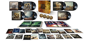
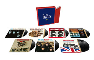
Music fans are also often avid collectors, and one interesting development in album art and presentation has been a growing market for the deluxe box set market. The artwork and packaging in this field has grown more inventive, sometimes tipping a nod to the original creative process. Soundgarden’s third studio album, 1991’s Badmotorfinger, was reissued in a seven-disc edition with a 52-page booklet and extras that included a 3D Lenticular lithograph of the Badmotorfinger icon, an iron-on patch, and, impressively, a revolving battery-operated saw.
Sometimes the box set is just classy and full of interesting reproduction mementos – the Louis Armstrong Ambassador Of Jazz collection, contained in a small replica suitcase, is a good example. Motörhead’s The Complete Early Years came complete with a skull with red light-up eyes.
All these innovations are breathing new life into the album artwork scene, while advances are also being made in motion graphics and kinetic typography. A whole new world of music new-media awaits.
And, of course, the renewed popularity of vinyl means a return of album art design in its original form. Modern superstars such as Kendrick Lamar, Lorde, Stormzy, and Evanescence are among 21st-century musicians whose albums showcase interesting album art.
Perhaps the next few decades will produce something to match The Beatles’ iconic “White Album” package, Carly Simon’s sensual black-and-white Playing Possum; Sex Pistols’ bold yellow-and-pink Never Mind the Bollocks… cover or any of the masterful Blue Note covers of the post-war era. Music and art will always go hand in hand.


