The Complete Package: How Album Packaging Amplified Music
Album packaging has evolved over six decades. Excellent artwork still matters, and the future promises many advances for digital music and new media.
Album packaging has been in transition (and in vogue) for more than six decades. The Recording Academy has acknowledged it since 1959, when the first Grammy for Best Recording Package was won, by Frank Sinatra. The singer was allegedly the art director for the album Frank Sinatra Sings For Only The Lonely, which featured Nicholas Volep’s Harlequin-style painting of a sorrowful Ol’ Blue Eyes (who had not long been divorced by Ava Gardner) in clown makeup and deep shadow.
60s innovations
Though the artwork was compelling, there was nothing radical about the actual packaging. The innovations in that field came in the 60s, and nothing matched the impact of The Beatles’ packaging for Sgt Pepper’s Lonely Hearts Club Band in 1967. The back cover was red, with a small photograph of the Fab Four at the bottom and song lyrics printed in black over the entire back. It was the first time lyrics had been printed on an album cover. The Beatles insisted on this, even though their music publishing company expressed fears that it would diminish the sales of sheet music. (Recently reissued as a super deluxe box set, Sgt Pepper’s groundbreaking front cover was reimagined as a 3D lenticular artwork.)
A year later, the packaging of their album The Beatles produced more shock waves. Almost immediately, a shorthand description of the record’s design replaced its actual title, and the album became known forever as “The White Album”. The cover of the double-LP, in a gatefold sleeve designed by Richard Hamilton, was completely white and glossy, with an embossed imprint of the group’s name. It also featured a unique stamped serial number (Ringo Starr’s personal copy, numbered 0000001, sold for $790,000 in a 2015 auction).
The Beatles were astute at marketing and promotion, and every year between 1963 and ’69 they issued a Christmas recording which was made into a flexi disc – a record issued as a thin flexible vinyl sheet – and sent to members of their fan club. Flexi discs, which started in Japan, were popular in magazines as “giveaway” promotional extras to raise circulation. Sometimes bands used them to issue rare tracks. Elvis Costello’s ‘23 Minutes Over Brussels’ and Adam Ant’s version of ‘YMCA’ (named ‘ANTS’) were both issued on flexi discs. Though the market has largely disappeared, there are occasional new flexi disc promotions, such as ‘Freedom At 21’, a track from Jack White’s Blunderbuss album, released in 2012.
Increasingly creative
As different music companies and musicians have tried to be ever more creative, the range of album packaging has increased. The Alan Parsons Project’s Stereotomy came in a translucent plastic sleeve; the artwork for Curved Air’s Second Album had five different layers, in different colours. But one innovation that has been aped frequently is a 3D album cover. The first was The Rolling Stones’ Their Satantic Majesties Request, which was released in a gatefold sleeve with a 3D image on the front and a special psychedelic printed inner sleeve (fully replicated in a 50th-anniversary deluxe box set reissue). The Stones also issued Sticky Fingers in a sleeve which had a real metal zipper that unzipped to reveal an image of cotton underpants and wording which reveals the name of Andy Warhol and the words “THIS PHOTOGRAPH MAY NOT BE – ETC”.
Sometimes the record – and the times – dictate different packaging: John Lennon And Yoko Ono’s Unfinished Music No.1: Two Virgins was so controversial that it had to be released in a brown paper sleeve to hide the naked images on the cover.
The original vinyl for Jefferson Airplane’s Bark (1971) also had an outer brown casing – resembling a grocery store bag – housing the “JA” logo, with a hole through which peeked the image of a fish with human false teeth wrapped in paper and tied with string. Inside the bag was the real cover and a lyric sheet that resembled a butcher’s order form.
One man who really made a (religious) mark on the history of album packaging was Larry Shaw, head of Stax’s art department. Shaw was responsible for the remarkable cover of Isaac Hayes’ 1971 album Black Moses, which has been hailed as one of the greatest album covers ever, including by us at uDiscover Music. Hayes was dressed in Moses attire and the double-album was encased in a sleeve that folded out into a four-foot high, three-foot wide cross.
Brilliant designers
Sometimes a brilliant designer can change the face of album packaging. Photographer Dennis Morris, who had taken some of the iconic images of Bob Marley and Sex Pistols in the 70s, was asked by Public Image Ltd to come up with an album design in 1979. When he said he wanted the three 45rpm singles to be contained in a metal box (a design which gave the record its name), the record company were wary of the costs involved in producing the metal boxes. Morris found a local company in London who made equipment for movies, and their metal film canisters were the same size as 12” vinyl. “We bought a job lot off them,” said Dennis, “and then just got the PiL logo embossed. So it actually turned out cheaper than expected.”
Cost can be a decisive factor in album packaging. Ogdens’ Nut Gone Flake, the 1968 album by Small Faces, was first issued in a round novelty package that was a metal replica of a giant tobacco tin. It proved too expensive – and the tins tended to roll off of shelves in record shops – and was soon replaced by a card version with a gatefold sleeve.
Another groundbreaking design was by Mark Farrow for English rock band Spiritualized. Farrow won a host of awards for his design for their 1997 album, Ladies And Gentlemen We Are Floating In Space. The initial idea was prompted by singer Jason Pierce’s comment in the first design meeting that “music is medicine for the soul”. The album was housed in in the blister-pack style of a pharmaceutical product, complete with liner notes written on similar paper and in similar style to patient instructions.
Things don’t always work out so smoothly, however. Craig Braun’s album packaging for Alice Cooper’s School’s Out, which had a sleeve that folded out to create a school desk, contained the vinyl and a pair of underwear. The production was recalled because the material was a fire hazard.
Deluxe box sets
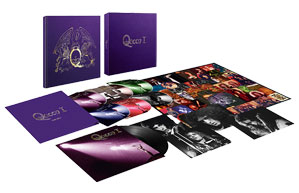
In recent years there has been a growing market for the deluxe box set market. As well as suiting the avid collector (the sets are often released with outtakes from an original album, along with comprehensive sleeve notes), they are often highly inventive. Soundgarden’s 1991 album, Badmotorfinger, was re-released in a seven-disc edition with extras that included a revolving battery-operated saw box.
In 2018, Guns N’ Roses’ Locked N’ Loaded edition of Appetite For Destruction upped the ante. Coming in a custom 12” x 12” x 12” solid-wood box that’s wrapped in embossed faux-leather and adorned with the original artworks’s Appetite cross rendered in hand-painted 3D wood, the box housed a slew of collectable items, among them GNR skull rings, guitar picks, original lithograph illustrations for each song, a bandanna, replica gig flyers, GNR coin, posters, replica ticket stubs, temporary tattoo sheets, patches, a slipmat and 7” adaptor… basically, a full magazine of GNR mayhem.
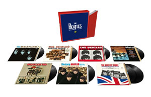
Box sets can be conceptual or contain gimmicks, such as Motörhead’s The Complete Early Years, which came complete with a skull with red light-up eyes. The comeback of vinyl has also added to the demand for different products, as with Status Quo and their Vinyl Singles Collection series.
Pushing the limits
One modern band that has pushed the limits of taste with packaging is The Flaming Lips. In 2011, Wayne Coyne and his band released a four-song EP on a USB stick, inside a seven-pound edible gummy skull. The EP sold out and prompted the band to go even further. They followed this with a three-track EP consisting of a USB drive embedded inside a gummy foetus. In 2014, The Strokes’ Julian Casablancas issued MP3s of the tracks of his new solo album, Tyranny, on a USB stick that also doubled as a cigarette lighter.
The label “one of a kind” is applied to many albums, but in the case of one Wu-Tang Clan release that is literally true. When they issued the album The Wu: Once Upon A Time In Shaolin, in 2014, there was only one copy. The 31 tracks, presented in a hand-carved nickel box designed by British-Moroccan artist Yahva, featured a guest appearance by Bonnie Jo Mason and some of the Barcelona football squad. The story of the album’s ownership is a long and winding one.
The future promises all sorts of advances in packaging digital music, such as motion graphics or new media. However, it is good to see that excellent packaging still matters, as designer Jonathan Barnbrook acknowledged when he won the 2017 Grammy for Best Packaging for his surprise-packed star die-cut design for David Bowie’s final album, ★.



Michael Rodifer
September 28, 2017 at 8:08 pm
Nice article. If you haven’t seen them, two of the most stunning album packages I’ve ever seen are Zappa’s “Civilization Phaze III (which won a Grammy for its packaging) and the legendary Japan-only Santana live album “Lotus” — a sprawling 3-LP vinyl set that is gorgeous. (There is an incredible, expensive Japanese CD-sized reproduction of the entire thing. Truly amazing.)
Rik_K
October 7, 2021 at 6:27 am
I buy music on digital discs and on vinyl. For the latter, I only buy gatefold sleeve issues though. The reason is that I have almost no room to store vinyl, so I need some kind of restricting qualifier to prevent me from buying too many.