New Poll Rates The Rolling Stones Logo As The Most Iconic Design Of All Time
The logo beat off competition from the well-known silhouette of Che Guevara, which came in second, and the Hard Rock Cafe logo in third.
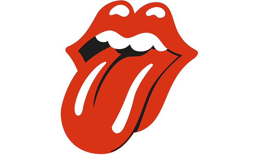
The Rolling Stones “tongue and lip” logo is now recognised the most iconic T-shirt design of all time. As reported in a recently-conducted poll, the logo beat off stiff competition from the well-known silhouette of Che Guevara, which came in second, and the Hard Rock Cafe logo in third.
The Nike “Just Do It” motto bearing the famous Nike “Swoosh” placed fourth. Also appearing in the top 10 were the Superman ‘S’ logo, the 1980s “Frankie Says Relax” design popularised by the band Frankie Goes to Hollywood and the classic “I Heart NY” print.
Other popular T-shirts include the triangle refracting light, also seen on the cover of Pink Floyd’s Dark Side of the Moon, and the Batman logo. The yellow smiley face beloved in rave culture, Harley Davidson’s logo and the classic “…and all I got was this lousy t-shirt” design also feature in the list.
The world famous Rolling Stones motif was created in April 1970 by designer John Pasche. It has often been said that the logo resembles Mick Jagger’s own lips and captures the band’s rebelliousness.
At the time, Pasche was a 25-year-old student at the Royal College of Art who has previously done some work on a poster for a forthcoming Rolling Stones tour which impressed Mick Jagger. Pleased with his work, Jagger commissioned Pasche to come up with a logo for the brand new company Rolling Stones Records, which was being prepared to release the band’s material after the band left their original company Decca.
Originally, the commission was for “a logo or symbol which may be used on note paper, as a programme cover and as a cover for the press book”.
Pasche recently told Radio X: “A lot of people ask me if it was based on Mick Jagger’s lips – and I have to say it wasn’t, initially. But it might have been something that was unconscious and also really dovetailed into the basic idea of the design. It was a number of things.”
The design first appeared on the album Sticky Fingers in April 1971, and has been used ever since. The artist believes the design has stood the test of time because, “It’s universal statement, I mean sticking out your tongue at something is very anti-authority, a protest really… various generations have picked that up.”
Explore Our Rolling Stones Artist Page.





Mary Ann Pandiscia
November 3, 2018 at 2:37 am
What about the mushroom used by the Allman Brothers Band???
Stefan Ebe
November 7, 2018 at 5:41 pm
Dankeschön
Für diese Auszeichnung.
Jeni McRae
November 11, 2018 at 9:32 am
Wow I’ve got the most recognisable logo tattooed on me. Considering I was born in 1970 it fitting